Why I’ll Always Choose A Colorful Wedding Over Beige Trends
We all remember the era when your wedding was supposed to look like it took place in a French château, even if you’d never been to France and your closest connection was singing along to “Les Poissons” with the crab-cooking chef in The Little Mermaid.
It was refined. It was clean. It was “ethereal.”
Everything was ethereal.
If it hadn’t been drained of color and wasn’t soft enough to float away in the slightest gust of wind, it simply wasn’t ethereal enough.
That was the former regime.
We’re well into the 2020s now, folks. This is our Taylor Swift era. The era of individuality, storytelling, and being unapologetically ourselves. Our weddings should get to do the same.
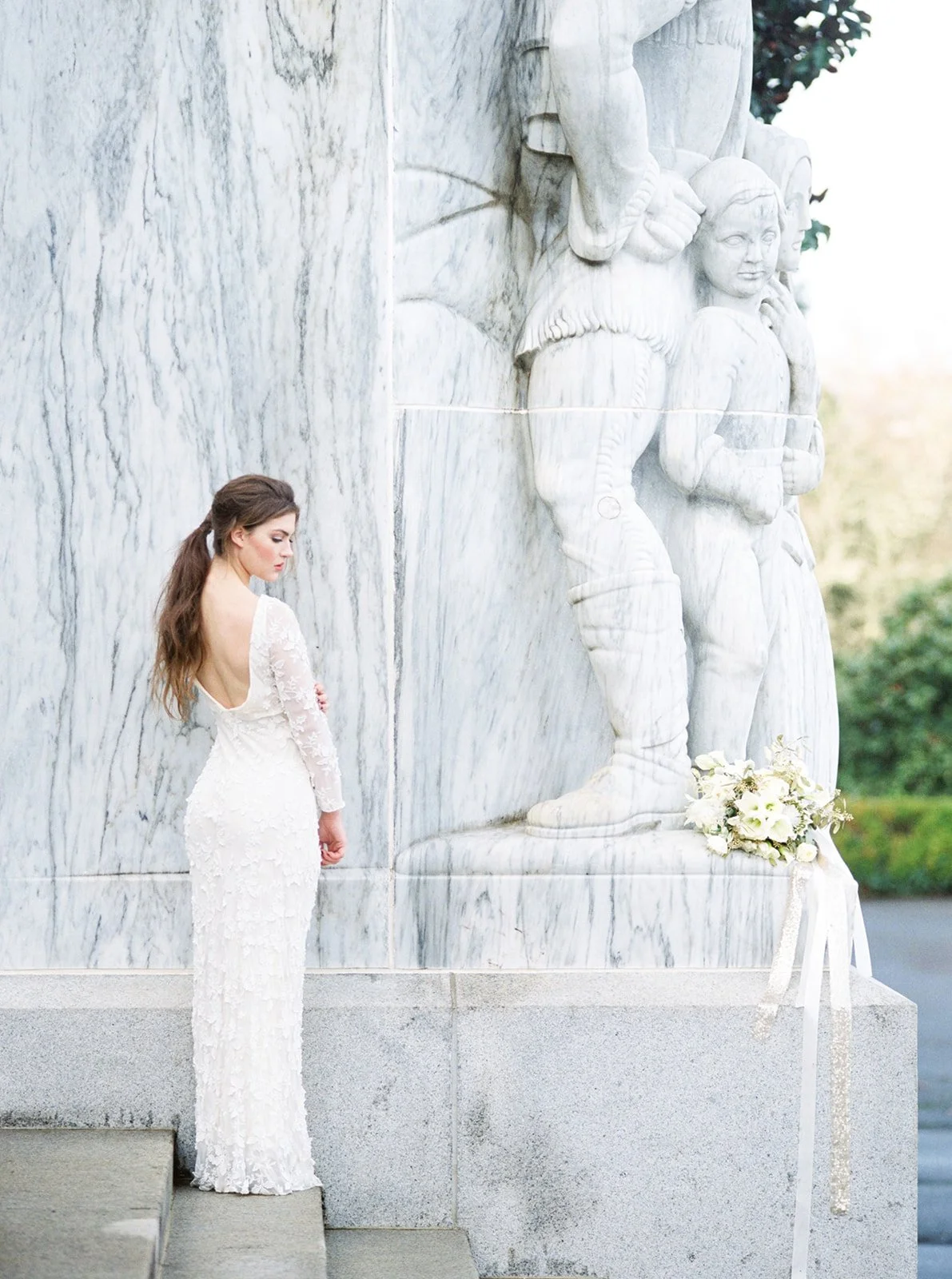
That doesn’t mean beige has been banished. I have nothing against beige. Neutrals can make a room feel calm, a photograph feel reverent, and a stone building look beautifully timeless. But when every wedding is softened down to the same palette of cream, champagne, taupe, and something called “sun-washed linen,” it starts to feel less like a reflection of two real, live people and more like everyone shopped from the same, albeit very tasteful, Pinterest board.
A wedding is already overflowing with personality, history, relationships, traditions, inside jokes, favorite places, family recipes, sentimental objects, and people wearing outfits they may have crossed oceans to find. Color gives all of that somewhere to live.
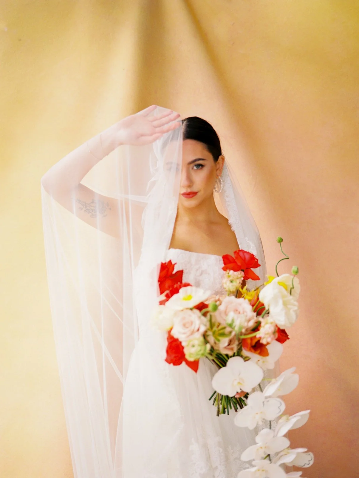
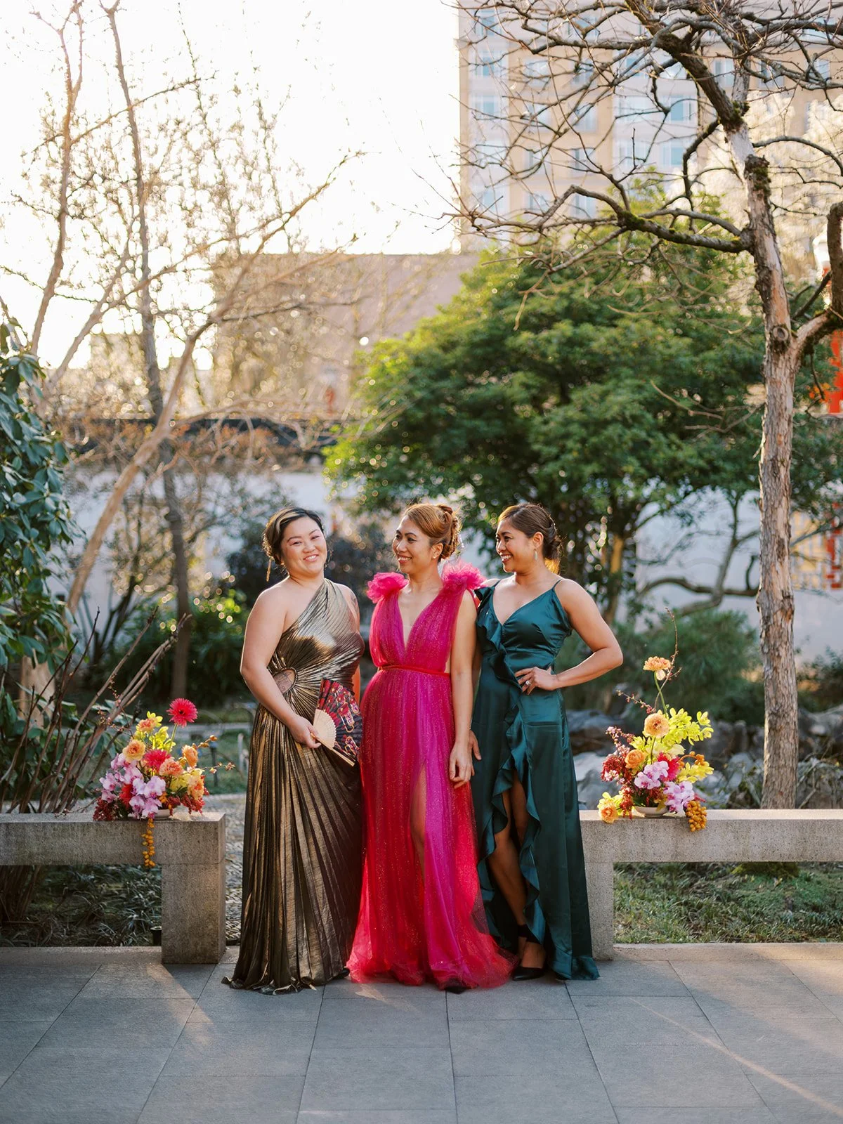
And no, that doesn’t mean every wedding needs to look like a box of crayons threw a formal dinner. Color can be rich or restrained, bright or moody, playful or incredibly refined. It can fill an entire reception room or appear in one perfect red dress.
The best colorful weddings aren’t colorful simply for the sake of it. They use wedding colors, meaningful details, fashion, flowers, and cultural traditions to tell you something about the people getting married. So if you’re trying to create a colorful wedding that still feels sophisticated, personal, and cohesive, start there—not with a trending palette.
Beige Isn’t the Villain. Forgettable Is.
Neutral weddings can be gorgeous. Give me old stone, layers of linen, warm candlelight, dark wood, and a room with beautiful architecture, and I will happily photograph every last creamy detail.
The problem isn’t beige itself. It’s choosing beige because it’s the safest answer.
When every decision is made around what feels timeless, tasteful, or least likely to regret later, couples can accidentally edit themselves out of their own wedding. The restaurant where you had your first date becomes a generic ballroom. The flowers your grandmother grew become white roses. The colors woven throughout your family’s celebrations disappear because someone said they might be “too loud.”
But timeless and neutral aren’t synonymous. It means creating something that’s rooted in an idea deeper than a trend.
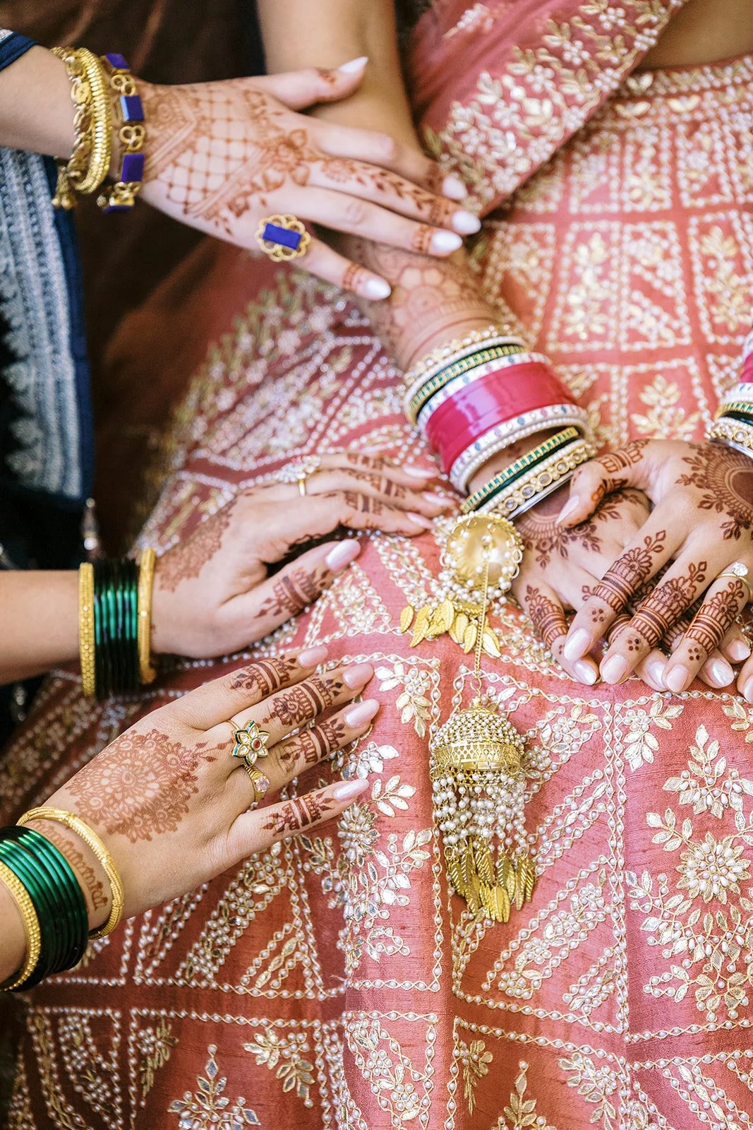
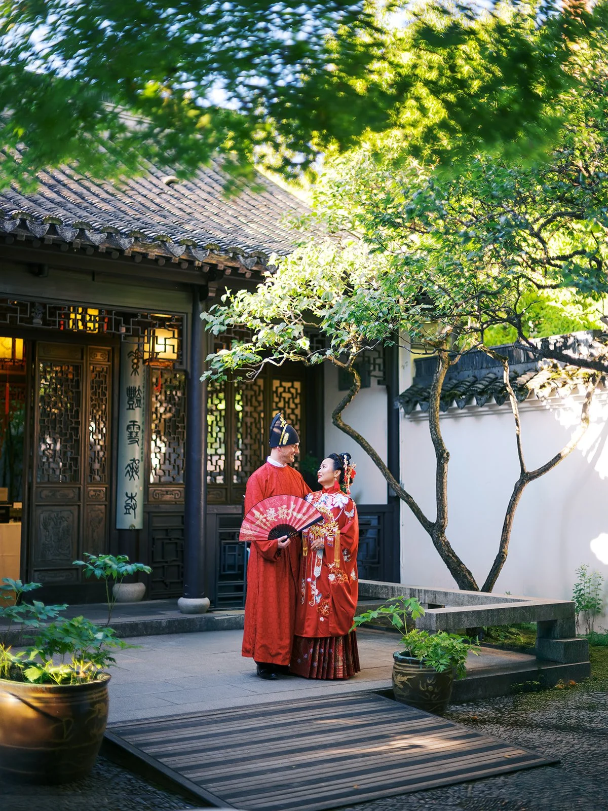
A wedding filled with personal references will age far better than one designed to look exactly like the weddings being posted everywhere that year. You’ll eventually forget which shade of greige was having a moment, but you won’t forget the marigolds from your haldi, the colors of the hand-painted tiles that reminded you of home, or the deep red fabric your mother helped fasten around you while everyone tried not to cry.
The Best Colorful Weddings Don’t Begin With a Color Palette
The key to building a colorful wedding that feels personal rather than trendy isn’t by asking which colors are popular right now.
Start with what is already yours.
Look at the places you love, the clothes you feel incredible wearing, the artwork in your home, the food you grew up eating, the flowers that grew outside your childhood house, the colors that show up in your cultural or family traditions. Think about the mood you want to create too. A candlelit dinner in a historic hotel may call for something entirely different than a summer garden wedding or a dance floor that needs to stay alive until midnight.
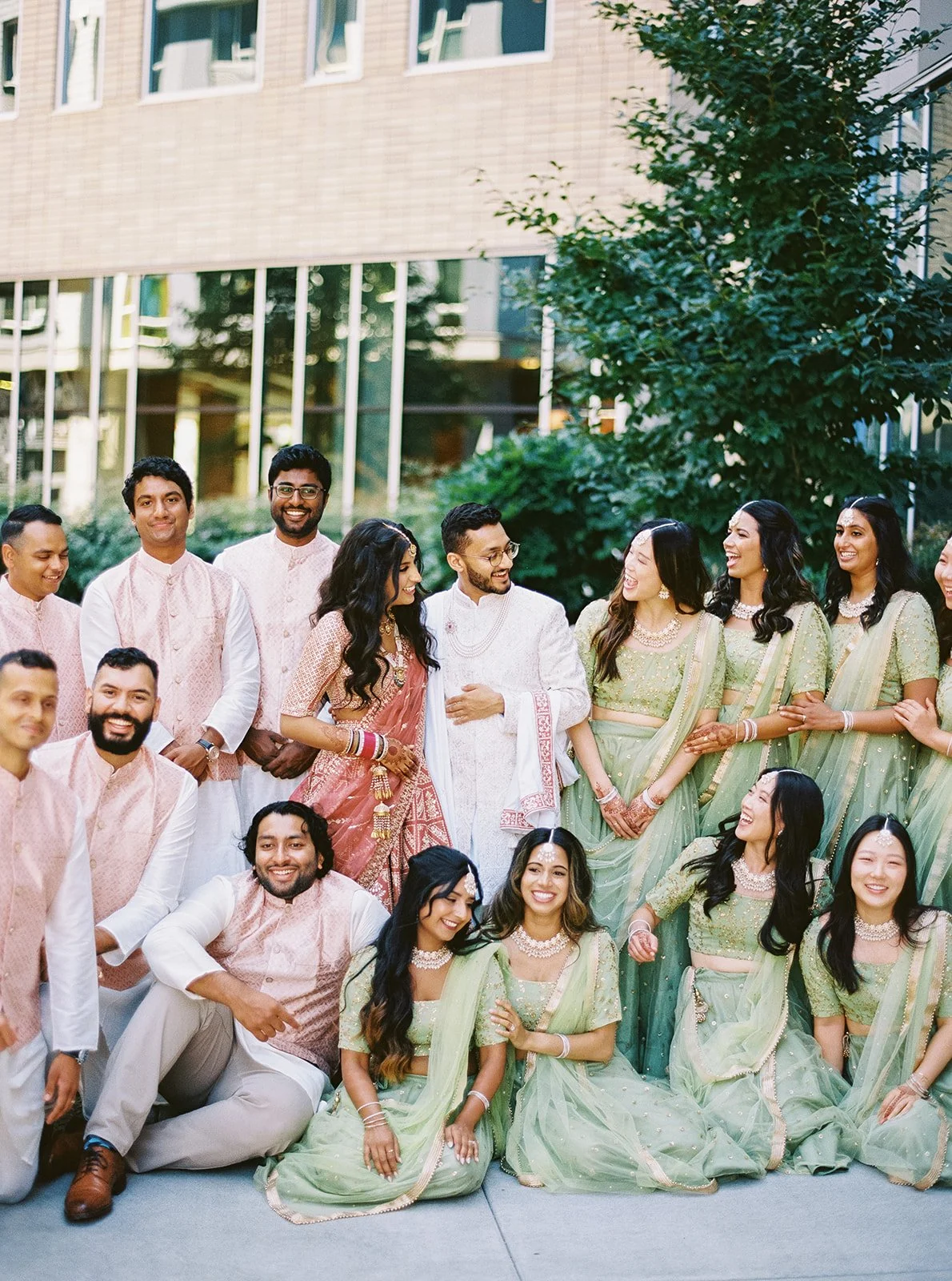
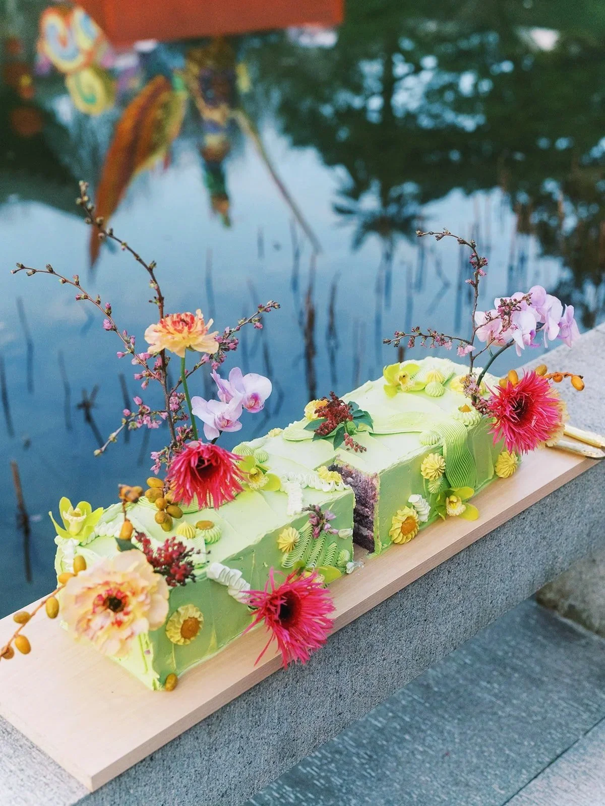
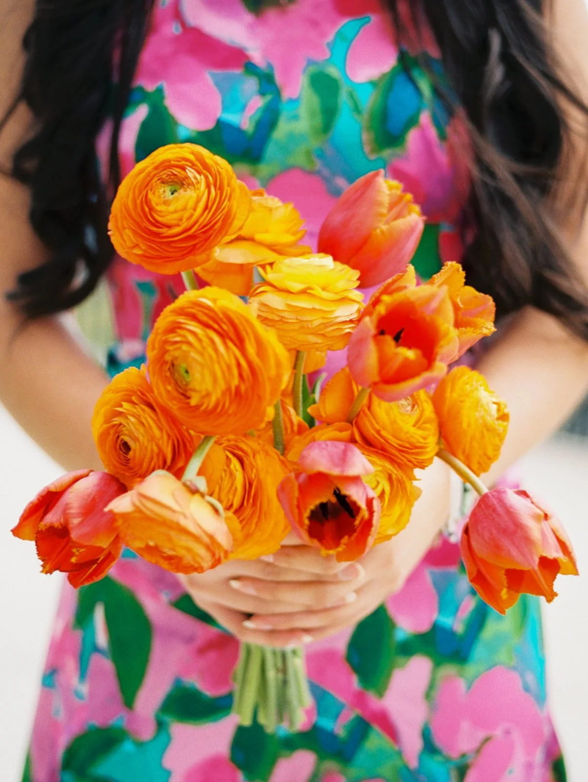
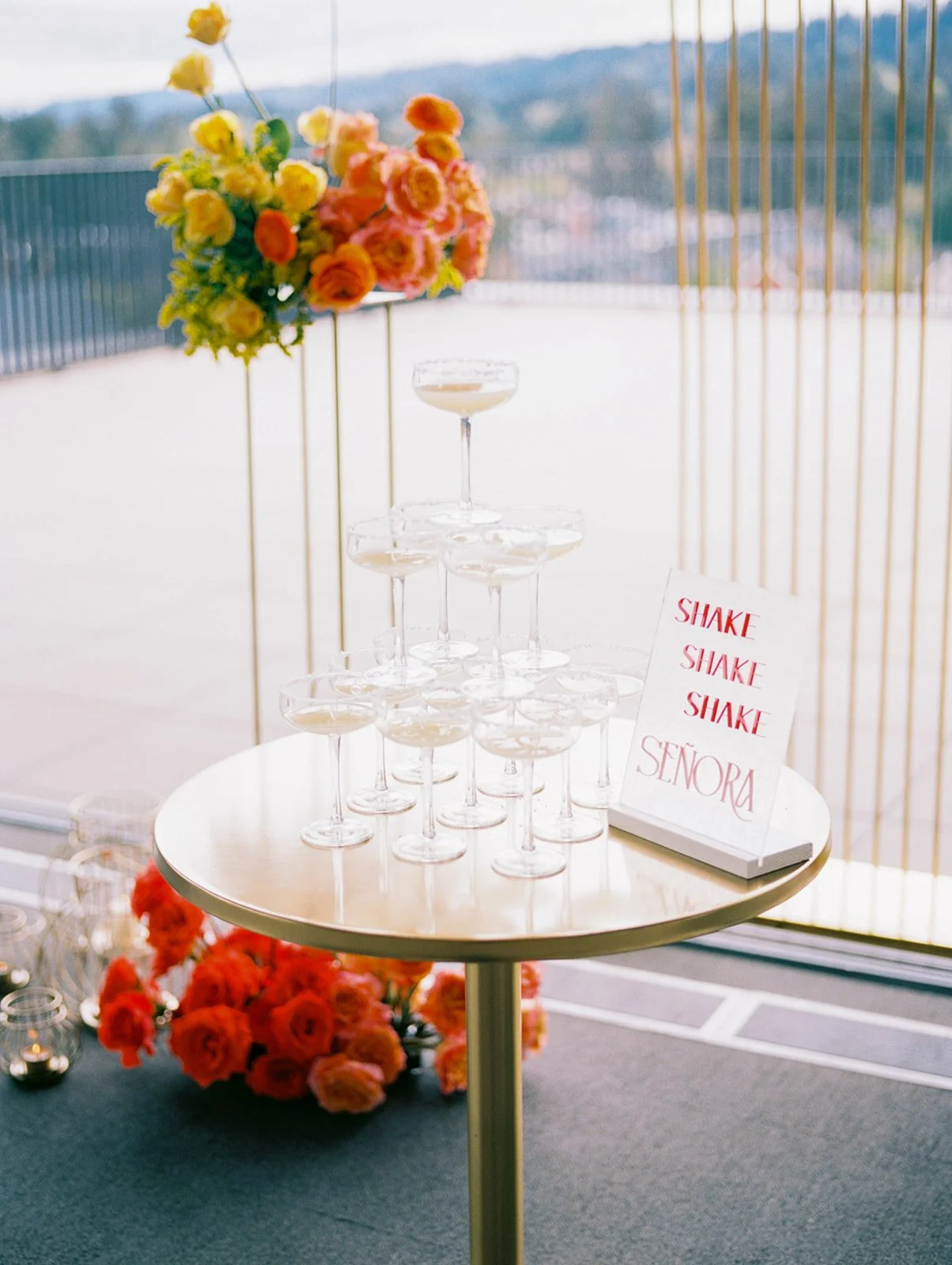
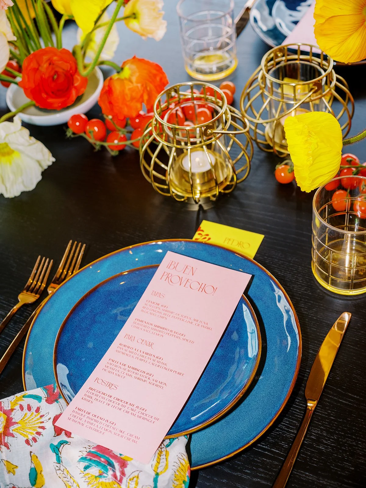
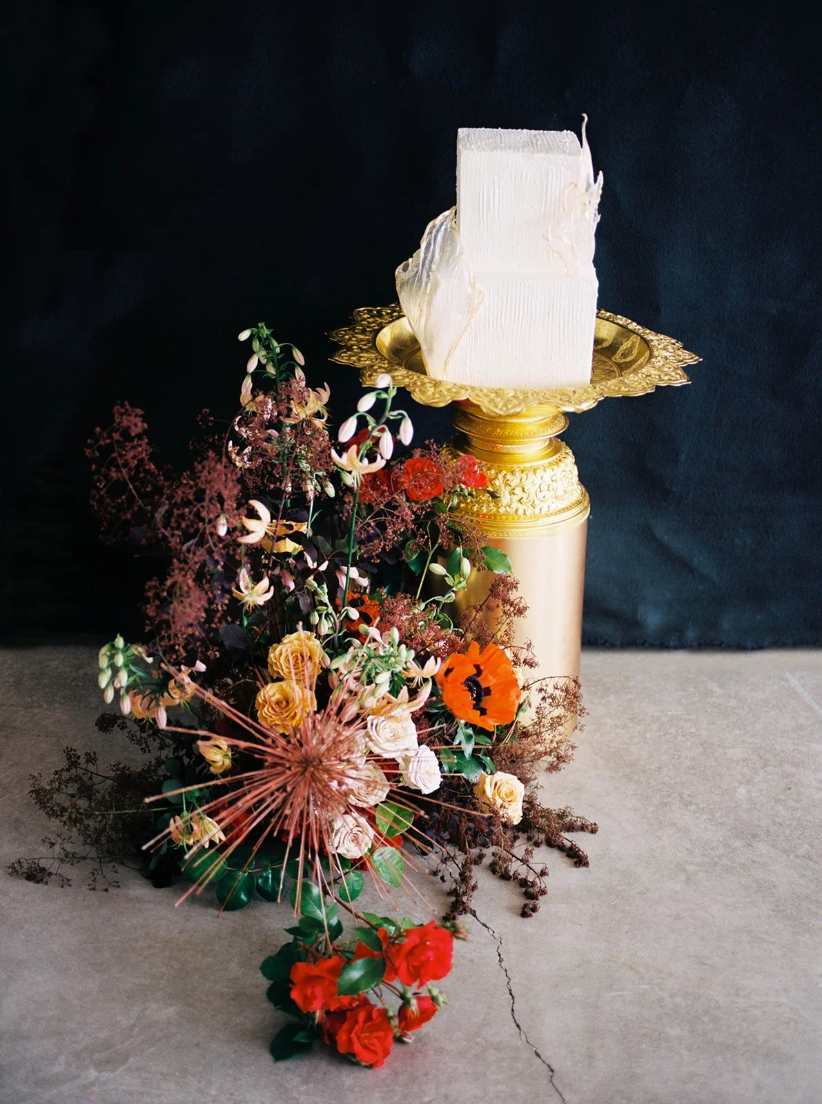
Color also doesn’t have to enter the conversation in the form of one enormous floral installation. It can show up in the outfits your guests wear, the cocktails being passed around, the menus on the plating, patterned linens, or even the fruit piled across the tables. Sometimes the venue has already done the work for you with painted walls, old tile, wallpaper, artwork, or a landscape worth borrowing from. Then the sun goes down, the reception lights come on, and the whole palette gets to reinvent itself again.
Don’t stress yourself out trying to make everything match either. Truthfully, the weddings that feel most layered almost never do.
Think of your palette like a good pair of eyebrows: they’re clearly sisters, but nobody needs them to be twins.
What Color Adds That Beige Can’t
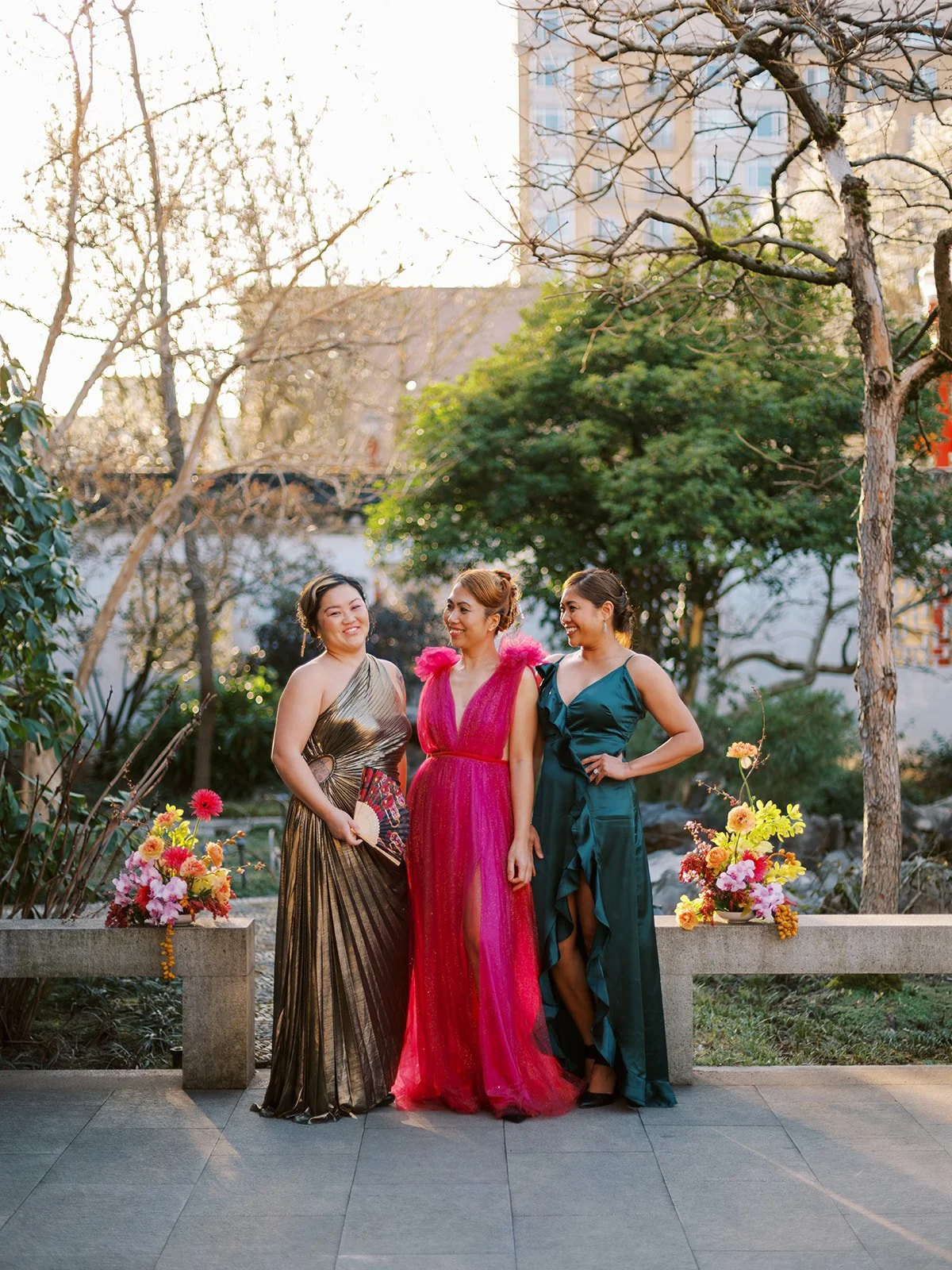
Color can do more than make wedding photos pop. It can give each part of the day its own visual identity and time stamp.
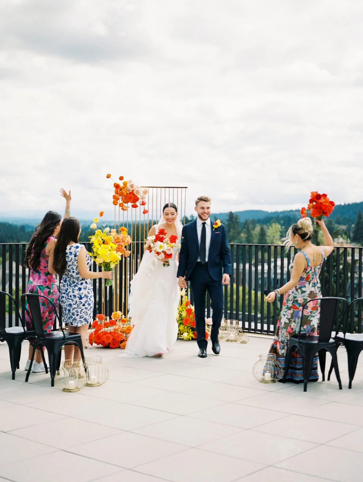
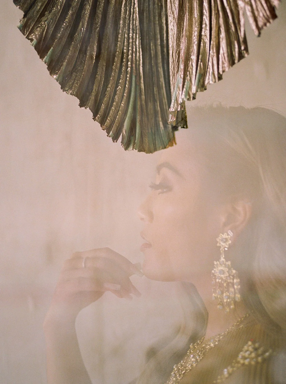
The getting-ready photos can pull from the colors and textures of the clothing, jewelry, or room. The ceremony can introduce traditions, florals, and atmosphere. Portraits can play off the architecture or landscape. Then the reception lights come on, the dance floor fills, and the photos shift right along with the energy.
All of that variety becomes clear when those images are placed together in a full wedding gallery. Instead of hundreds of photographs all blending into one long stretch of cream, each part of the day feels distinct yet still part of the same story.
If you want to see what that looks like across an entire celebration, explore more colorful and cultural weddings in my portfolio.
As a Portland wedding photographer, I’m constantly looking for ways those colors can work together in a photo. A saffron fabric folded on a chair. A cobalt suit against a peach wall. Red florals that happen to match someone’s lipstick. Beadwork that catches the colored lights on the dance floor. Some are planned by a designer. Others are happy little accidents I notice before they disappear.
Color also gives me more ways to shape the mood of a photograph. Warm candlelight can make a quiet moment feel more intimate. A bold wall can turn a straightforward portrait into something powerful or editorial. Colorful, patterned linens let me layer with playful double exposures.
None of that creates an emotion that wasn’t there. It simply helps the photograph remember it accurately.
The Smallest Colorful Details Can Carry the Most Meaning
Some of my favorite colorful wedding ideas aren’t large floral installations or dramatically transformed reception rooms. They’re the small things with a story attached.
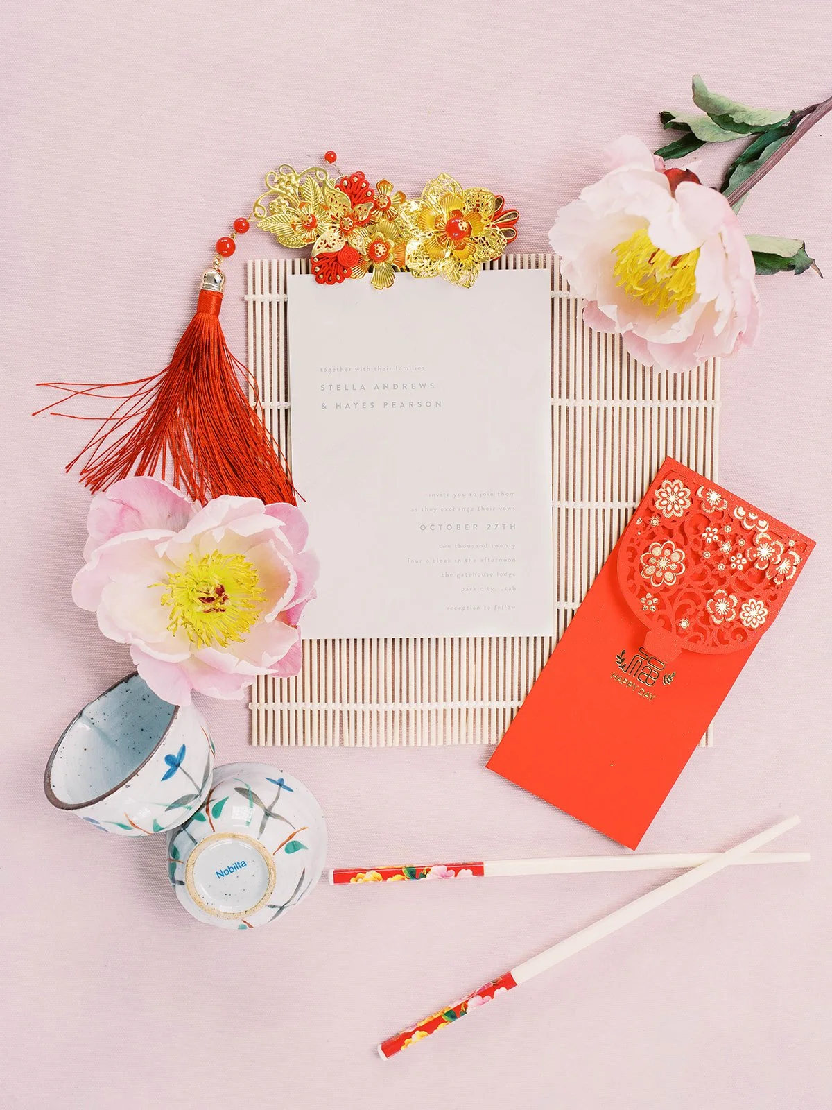
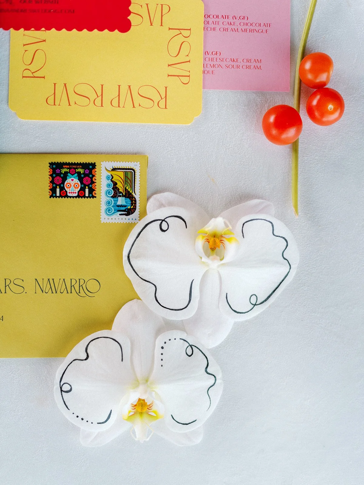
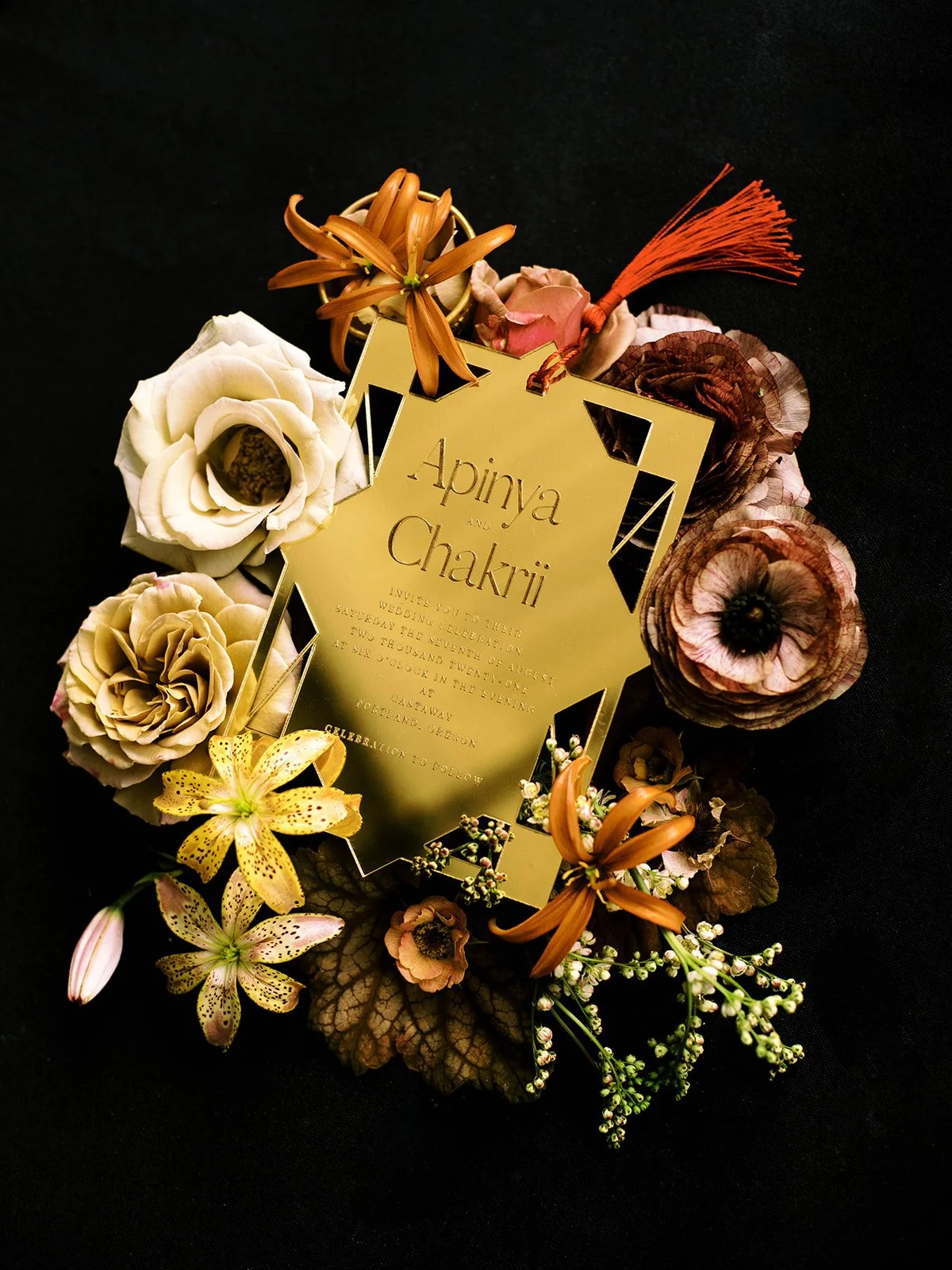
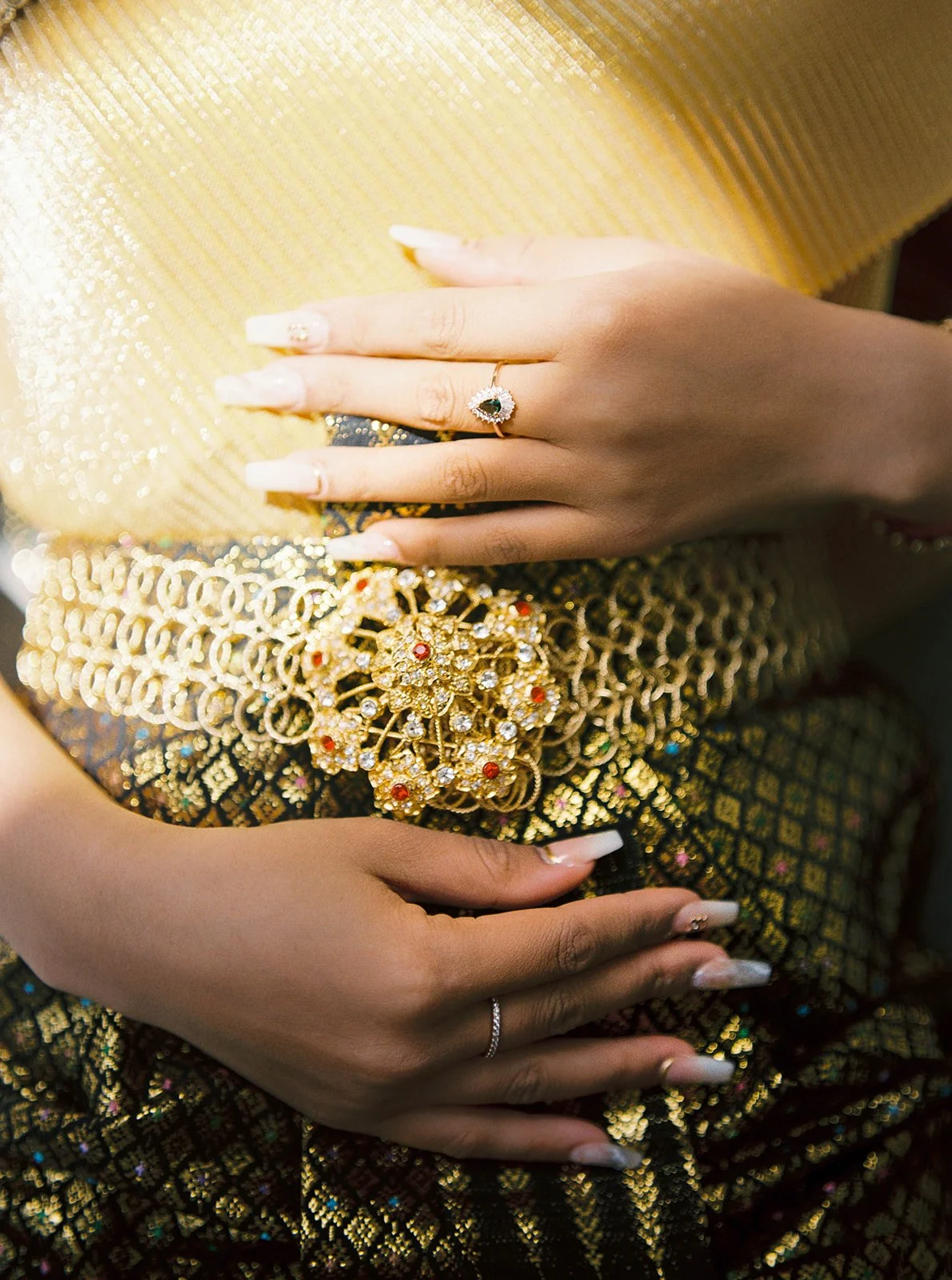
A piece of fabric brought from another country, jewelry passed down through generations, a familiar family knick knack tucked into the getting-ready room, wedding stationery inspired by a meaningful place, or even a favorite food served in dishes chosen because they resemble the ones at home. These details matter because they aren’t just decorating an empty space. They connect the wedding to a life that existed before it and a family history much larger than one day.
They’re also the building blocks of some of my favorite photographs.
A ring photographed on an heirloom textile immediately has more context. A menu surrounded by colorful food and glassware tells us something about the experience guests were having. A parent adjusting a veil becomes even more emotionally layered when that veil is your late grandmother’s and carries family significance.
Meaning doesn’t require a giant sign explaining itself. Sometimes it lives quietly in the frame, waiting for the people who know the story to recognize it. Finding and creating those little easter eggs and insider secrets are what makes my job personally profound and fulfilling.
Not Every Detail Needs the Lead Role
A colorful wedding doesn’t mandate that every surface has to shout at the same volume. Color tends to look more polished and sophisticated when there’s an obvious star of the show and everything else knows whether it’s part of the main cast or part of the ensemble.
Choose one or two places to make the biggest impact. Maybe it’s the ceremony flowers, the tablescape, what you’re wearing, or the lighting that transforms the reception after dark. Once you know what those moments are, the surrounding details can support them instead of launching their own campaigns for attention.
Carry a few colors into different parts of the day, but don’t worry about matching them perfectly. The coral in the flowers doesn’t need to be the exact coral printed on the invitations. Lighter, darker, and slightly different versions of the same colors will make the whole design feel more layered, especially when they appear across velvet, silk, paper, glass, flowers, and painted surfaces.
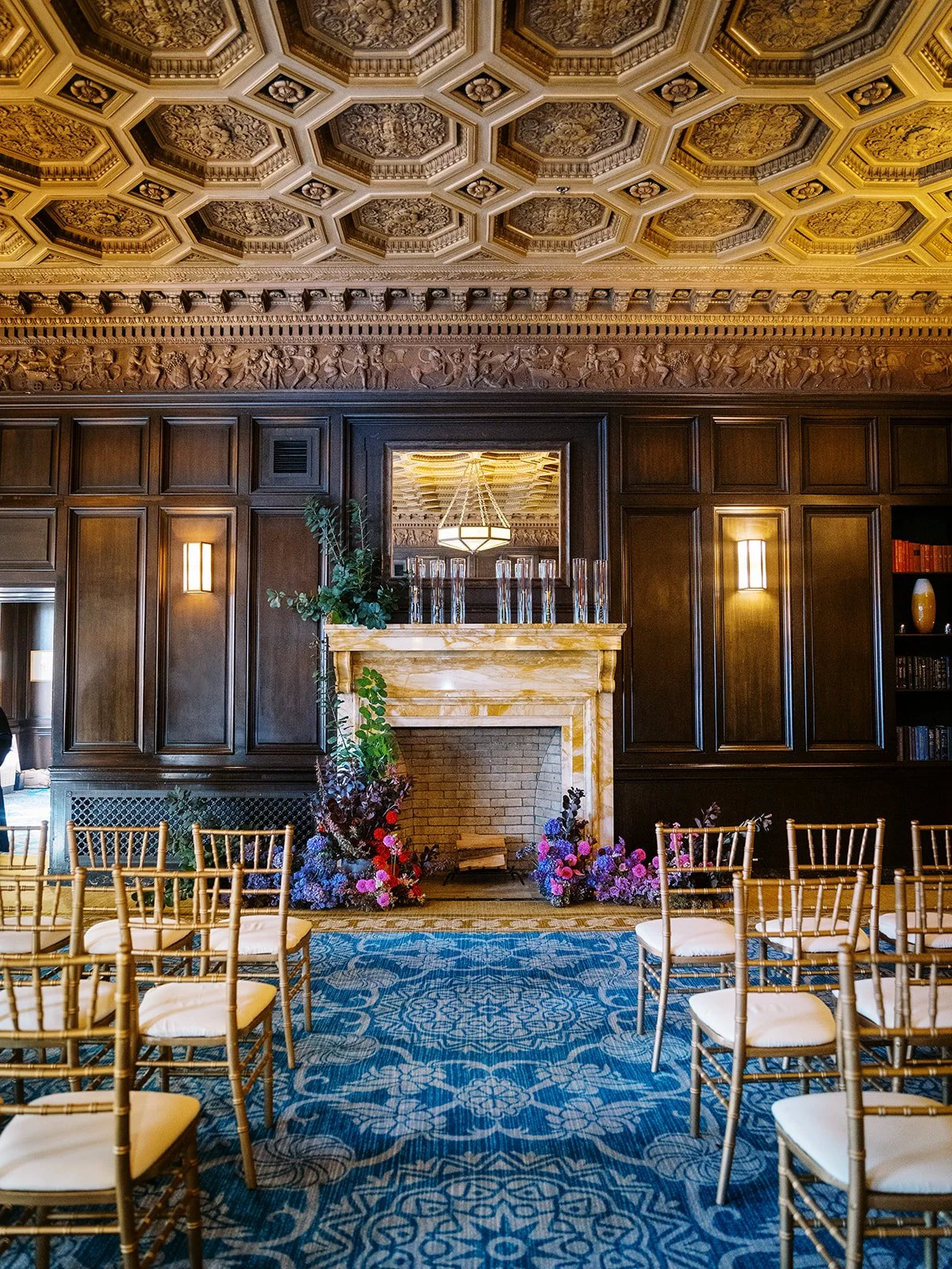
Pay attention to what the venue is already giving you too. Painted walls, patterned tile, artwork, gardens, or a dramatic landscape may be doing enough that you don’t need to decorate every available inch. Even neutral elements have a job here because they can give the bolder choices space to be noticed.
The goal isn’t to fit an infinite amount of colors into one room. It’s to choose which details deserve to make a grand entrance.
Borrow Your Palette From a Memory, a Place, or a Season
Some of the strongest wedding palettes begin with something more tangible than a collection of swatches.
Maybe it’s the faded blue and terracotta of a city you love. The green of the garden where you’re getting married. The burgundy booths and amber lighting in your favorite restaurant. Summer fruit piled across a family table. Wildflowers in May. The jewel tones that have always appeared in your family’s celebrations.
Starting with a memory or place gives the palette natural depth because real environments are never made from one exact shade.
A coastline isn’t simply blue. It contains gray, sea green, white, tan, and whatever color the sky happens to be that day. A garden isn’t merely green. It has shadow, sunlight, soil, petals, weathered stone, and a dozen versions of every leaf.
That complexity is what makes a palette feel lived in.
It also helps the wedding belong to its setting. Instead of placing a preselected aesthetic on top of a venue, start to notice what’s already beautiful there and build from that.
Why A Colorful Wedding Still Feels Elevated
Somewhere along the way, “elevated” became synonymous with spaces that look clean, clinical, and almost completely untouched by human life. But your guests probably aren’t hoping to spend the evening inside Kim Kardashian’s museum-aesthetic mansion. They want to walk into a wedding that feels like the two of you because they are there to celebrate that beauty.
An elevated wedding isn’t one that avoids color. It’s one where the choices feel thought out. The patterned linens relate to the stationery without matching it exactly. Bold formalwear is photographed against a backdrop that complements it instead of competing with it. The materials look and feel good up close, not just in the inspiration photo.
Saturated flowers can be every bit as polished as white ones. Pattern can make a table feel more sophisticated, not less. A colorful room can still feel clean and refined when there’s a clear sense of what should stand out and what should hang back.
Color doesn’t make a wedding look messy or less expensive. I’d argue the contrary, in fact. When elements are working together, color feels confident.
And confidence always looks expensive.
Choose the Wedding You’ll Actually Remember
Your wedding does not need to prove you have good taste by offending absolutely no one.
It can be elegant and joyful, meaningful and visually exciting, while holding the familiar colors that have appeared in your family’s celebrations for generations. It can borrow from a place you love. And choosing a shade for no deeper reason than it makes you ridiculously happy? Just as valid as choosing one with a dynastic lineage.
You don’t have to choose color simply because I say you should. What I really hope is that you choose something because it belongs to you or speaks to you, not because a trend made the safest answer feel like the right one.
Years from now, your photographs won’t matter because they perfectly documented what weddings looked like at the time. They’ll matter because you can still recognize the people, traditions, atmosphere, and tiny choices that made the day yours.
And if all of that happens to be surrounded by incredible color? Even better.
The goal was never to create a wedding that could belong to any era or any couple.
It was to create one that could only belong to you.
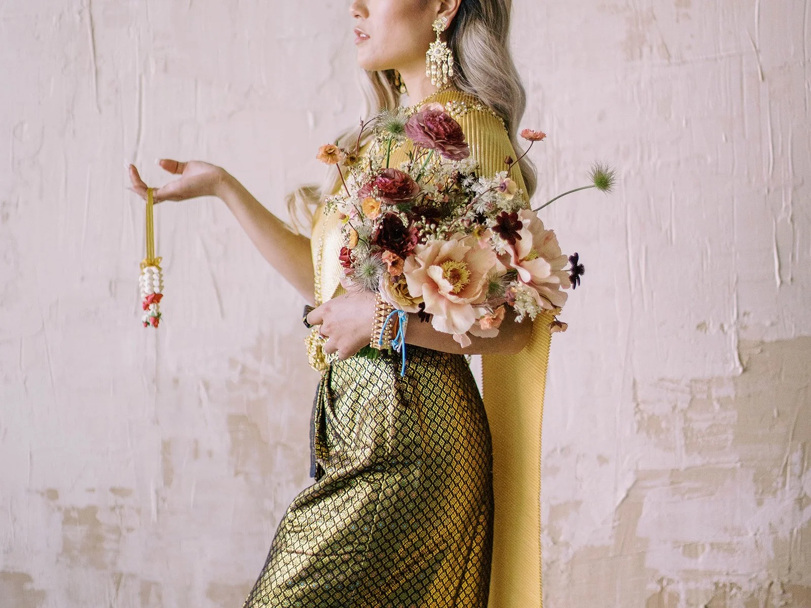
Planning something colorful, culturally layered, or difficult to describe in three Pinterest keywords? I'd love to hear about it.